How to Incorporate Luxe Abstract Art in Your Living Room
Contents
Preface
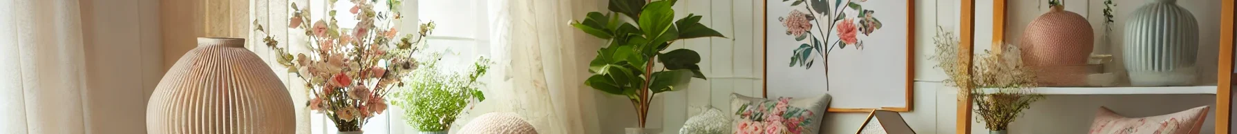
Luxe abstract art is more than just a decorative element—it’s a dialogue between your space and your identity. It has the power to transform a mundane living room into a curated sanctuary, where every brushstroke, color, and texture tells a story. Unlike traditional art, abstract pieces thrive on interpretation, allowing you to infuse your personality into the room without constraints. But integrating them seamlessly requires intention: from envisioning the mood to nailing the details like lighting and framing. This guide breaks down the process into actionable steps, ensuring your living room becomes a reflection of luxury, taste, and individuality.
Overview
Incorporating luxe abstract art is a journey of balancing vision, aesthetics, and functionality. It starts with defining your space’s vibe, then moves to selecting art that aligns with that vision, placing it strategically, enhancing it with lighting, and refining details like texture and framing. By blending personal taste with design principles, you’ll create a space that feels both elevated and authentic.
1. Start with a Vision
Your vision is the foundation of the entire process. It’s the “why” behind every choice, ensuring your art doesn’t just hang on the wall but belongs in the room.
Key Questions to Refine Your Vision
- Function First: How do you use your living room? Is it a lively hub for gatherings, a quiet reading nook, or a formal space for entertaining? A vibrant abstract piece might suit a social area, while a muted one could calm a relaxation zone.
- Existing Aesthetics: What’s the current “language” of your room? Note details like furniture silhouettes (sleek vs. plush), textile patterns (stripes, florals, solids), and architectural features (exposed beams, large windows).
- Emotional Goal: What feeling do you want to evoke? Serenity? Energy? Sophistication? Abstract art’s colors and forms directly influence mood—cool blues and soft greys for calm; bold reds and dynamic lines for vibrancy.
A Practical Checklist
- Dominant color scheme (e.g., neutral, earthy, jewel-toned).
- Desired role of the art (focal point vs. complementary element).
- Wall dimensions (measure height, width, and distance from furniture).
2. Choose the Right Piece
Selecting the perfect luxe abstract art is a mix of intuition and strategy. It should resonate with you and harmonize with your space.
Color Coordination
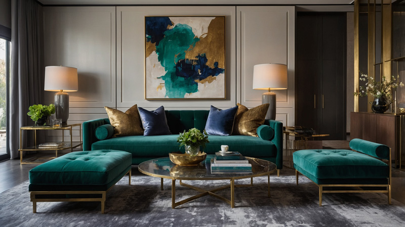
- Complementary Hues: Pair art with colors that exist in your room but in a different shade. For example, if your sofa is sage green, a piece with olive or emerald accents creates cohesion.
- Strategic Contrast: Use art to introduce a bold counterpoint. A navy-blue living room with cream furniture can shine with a mustard-yellow abstract piece—adding energy without clashing.
- Tonal Unity: For a minimalist look, stick to the same color family. A beige room with soft taupe art and warm ivory accents feels cohesive and luxe.
Size & Proportion
- Wall-to-Art Ratio: The art should cover 2/3 to 3/4 of your wall’s width. A 10-foot wall, for instance, works best with art 6.5–7.5 feet wide.
- Furniture Alignment: Above a sofa? The art should be 2–4 inches shorter than the sofa’s width to avoid imbalance.
- Scale with Space: In a large, open living room, a single oversized piece (4ft x 6ft+) makes a statement. In a cozy room, opt for medium-sized art (2ft x 3ft) to avoid overwhelming the area.
Style Consistency
- Modern Spaces: Lean into geometric shapes, sharp lines, and monochromatic palettes. Think bold blocks of color or minimalist drips.
- Eclectic Rooms: Mix styles—pair a fluid, organic abstract (think swirling pastels) with a structured, geometric piece, tied together by a shared color.
- Traditional Interiors: Soften the formality with abstracts that have rounded edges, muted tones, or subtle texture (e.g., a watercolor-inspired piece with gentle gradients).
3. Placement is Key
Even the most stunning art can fall flat with poor placement. Use these guidelines to ensure it shines.
Eye Level Rule
- The center of your art should sit 57–60 inches from the floor—the average eye level for adults. This ensures comfortable viewing whether seated or standing.
- Exception: In rooms with high ceilings (10ft+), raise the center to 62–65 inches to align with the room’s scale.
Above Furniture
- Sofas/Console Tables: Leave 6–8 inches between the top of the furniture and the bottom of the art. This gap creates breathing room and avoids a “crushed” look.
- Fireplaces: Hang art 3–5 inches above the mantel. If the mantel is wide, the art should be 2/3 its width to maintain balance.
Grouping Multiple Pieces
- Symmetric Layout: For a classic look, arrange identical-sized pieces in a grid (e.g., 2×2 or 3×3) with equal spacing (1–2 inches between them).
- Asymmetric Arrangement: Mix sizes for visual interest. Place a large central piece, then flank it with smaller ones, ensuring the total width still fits 2/3 of the wall.
- Storytelling Groupings: Curate pieces that share a theme (e.g., all using gold leaf, or inspired by nature) to create a cohesive narrative.
4. Lighting Makes a Difference
Lighting transforms how art is perceived—enhancing colors, textures, and depth.
Harness Natural Light
- Positioning: Place art near north-facing windows for soft, diffused light that won’t fade colors. Avoid direct south-facing sunlight, which can cause bleaching.
- Glare Solutions: Use anti-glare glass or matte finishes if the art is in a sunny spot.
Accent Lighting
- Spotlights/Track Lights: Install adjustable fixtures 12–18 inches from the wall, angled 30–45 degrees toward the art’s center. This highlights details without creating harsh shadows.
- Picture Lights: Mount slim, low-profile lights above or below the frame (ideal for smaller pieces). Opt for LED bulbs with a warm white (2700K–3000K) to complement most art.
Ambient Lighting
- Layer with Room Lights: Pair accent lighting with overhead fixtures or floor lamps. Warm ambient light (e.g., from a pendant lamp) softens the space, while the spotlight keeps focus on the art.
- Dimmers: Install dimmers for accent lights to adjust intensity—brighter for evening gatherings, softer for quiet nights.
5. Mix and Match
Combining multiple abstract pieces adds depth, but it requires finesse to avoid chaos.
Unify with a Color Palette
- Pick 2–3 core colors (e.g., charcoal, blush, and gold) and ensure each piece includes at least one. This creates a thread that ties diverse styles together.
- Example: A bold geometric piece with charcoal and gold can pair with a soft, blurry abstract in blush and gold—different forms, same palette.
Frame Consistency
- Material Harmony: Use frames of the same material (e.g., all brushed brass, all black wood) to create cohesion, even if art styles differ.
- Finish Variation: For subtle contrast, mix finishes within the same material—matte black frames with one glossy black frame as an accent.
Spacing Guidelines
- Small to Medium Pieces: Leave 2–3 inches between frames to avoid clutter.
- Large Pieces: Increase spacing to 4–6 inches to let each piece “breathe.”
- Floor-to-Ceiling Groupings: Start 8–10 inches from the floor for the bottom piece, ensuring the top piece is 4–6 inches below the ceiling.
6. Consider the Texture
Texture adds tactile and visual depth, making your living room feel more dynamic and luxurious.
Explore Mixed Media Art
- Materials to Look For:
- Canvas with impasto (thick, textured paint) for a sculptural feel.
- Pieces incorporating wood, metal, or resin for dimensionality.
- Textile-based art (e.g., abstract weavings or embroidered canvases) for softness.
Layer Textures in the Room
- Contrast with Surroundings: Pair a rough, textured art piece (e.g., a canvas with sand or gravel) with smooth surfaces like a marble coffee table or silk curtains.
- Complement Existing Textures: If your room has plush rugs and knit throws, choose art with subtle texture (e.g., watercolor washes) to create harmony.
The Role of Tactility
- Don’t underestimate the power of touch—textured art invites interaction, making the space feel more intimate. Run your hand over a piece with raised brushstrokes; the sensory experience enhances its impact.
7. Don’t Forget the Frame
A frame is the art’s “frame of reference”—it should enhance, not overshadow, the piece.
Style Alignment
- Minimalist Art: Opt for thin, unobtrusive frames (e.g., 1–2 inch-wide black or white wood) or go frameless for a sleek look.
- Bold, Vibrant Art: Use a neutral frame (e.g., natural wood or silver) to balance intensity without competing.
- Vintage-Inspired Abstracts: Choose ornate frames with carvings or gilding to amplify their timelessness.
Color & Material Choices
- Frame Color:
- Match the art’s dominant color for cohesion (e.g., a blue abstract in a navy frame).
- Use a contrasting color (e.g., a red abstract in a forest green frame) for drama.
- Neutral frames (white, black, beige) work universally and keep focus on the art.
- Materials:
- Wood (warm tones like oak or walnut) adds warmth.
- Metal (brass, chrome) suits modern or industrial spaces.
- Acrylic frames (clear or tinted) offer a contemporary, lightweight option.
Practical Considerations
- Protection: Choose frames with UV-protective glass to shield art from sunlight damage.
- Weight Support: Ensure frames are sturdy enough for heavy pieces—metal frames work best for large, textured art.
8. Create a Focal Point
Your luxe abstract art should command attention, anchoring the room’s design.
Strategic Positioning
- Prime Real Estate: Place art in high-visibility areas: above the sofa (the first thing guests see), over the fireplace, or on a wall opposite the entrance.
- Avoid Competing Focal Points: If you have a statement chandelier or large window with a view, position art to complement, not compete. For example, hang art beside the window rather than opposite it.
Enhance with Lighting
- Use a dedicated spotlight or picture light to draw the eye to the art, especially in dimly lit rooms. Dimming other lights in the evening can make the art the clear focal point.
Contrast for Impact
- Color Contrast: A white wall makes a bold, dark abstract pop; a dark wall makes a light-colored piece stand out.
- Style Contrast: A minimalist room with clean lines becomes more intriguing with a chaotic, energetic abstract art piece as the focal point.
9. Keep It Personal
Your living room should feel uniquely yours—and your art is the best way to express that.
Choose Art That Resonates
- Don’t follow trends blindly. If a piece makes you pause, evokes a memory, or sparks joy, it’s the right choice—even if it “breaks” design rules.
Weave in Your Story
- Travel Mementos: Pair a luxe abstract with souvenirs from your trips (e.g., a Moroccan rug with a blue abstract inspired by the Mediterranean).
- Family Connections: Hang art that reflects your heritage—e.g., a piece with patterns reminiscent of your cultural textiles.
Mix Art with Personal Items
- Display small family photos or heirlooms near the art to create a narrative. For example, place a vintage camera (a family relic) on a shelf below an abstract with camera-inspired shapes.
10. Rotate Your Collection
Rotating art keeps your space fresh and lets you enjoy different pieces throughout the year.
When to Rotate
- Seasonally: Swap art to match the season—bright, airy pieces in spring/summer; rich, warm tones in fall/winter.
- With Mood Changes: If you crave a new vibe, rotate in a piece with a different color palette (e.g., from cool to warm tones).
- Every 3–6 Months: This prevents the space from feeling stagnant without requiring a full redesign.
How to Rotate Safely
- Store Art Properly: Keep unused pieces in acid-free sleeves or padded cases, away from direct sunlight and moisture.
- Check Condition: Inspect art for dust or damage before rehanging—clean frames with a soft cloth and touch up any loose paint.
Refresh the Look Without New Art
- Reposition existing pieces in different groupings or swap frames to give them a “new” feel.
Conclusion
Incorporating luxe abstract art into your living room is an act of curation—blending vision, design principles, and personal taste. It’s not just about decorating; it’s about creating a space that tells your story, evokes emotion, and feels luxurious yet lived-in. By starting with a clear vision, choosing art that aligns with your space, and refining details like placement, lighting, and texture, you’ll transform your living room into a sanctuary that’s both stylish and uniquely yours. Remember, there are no strict rules—only guidelines to help you express yourself. Embrace the process, trust your instincts, and let your art lead the way. This journey isn’t just about the final look; it’s about enjoying the transformation of a room into a reflection of you.
 Best Luxury Bathroom Mirrors for a Stylish Touch
  Luxury Coastal Home Decor Ideas: Elevate Your Beach House with Timeless Elegance
 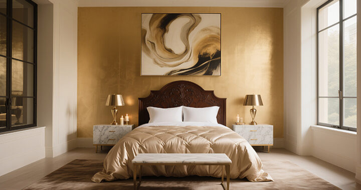 Home Decor Ideas to Make Your Home Feel Like a Luxury Hotel
 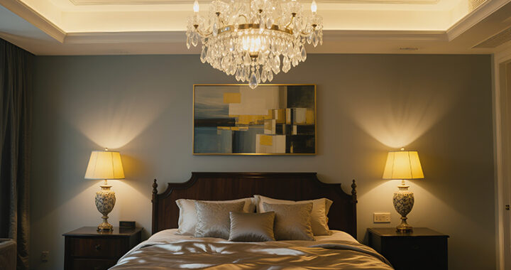 Best Luxury Accent Lighting for Every Room
  Best Luxury Candles for a Cozy and Elegant Home
  Best Luxury Bed Frames for a Stylish Bedroom